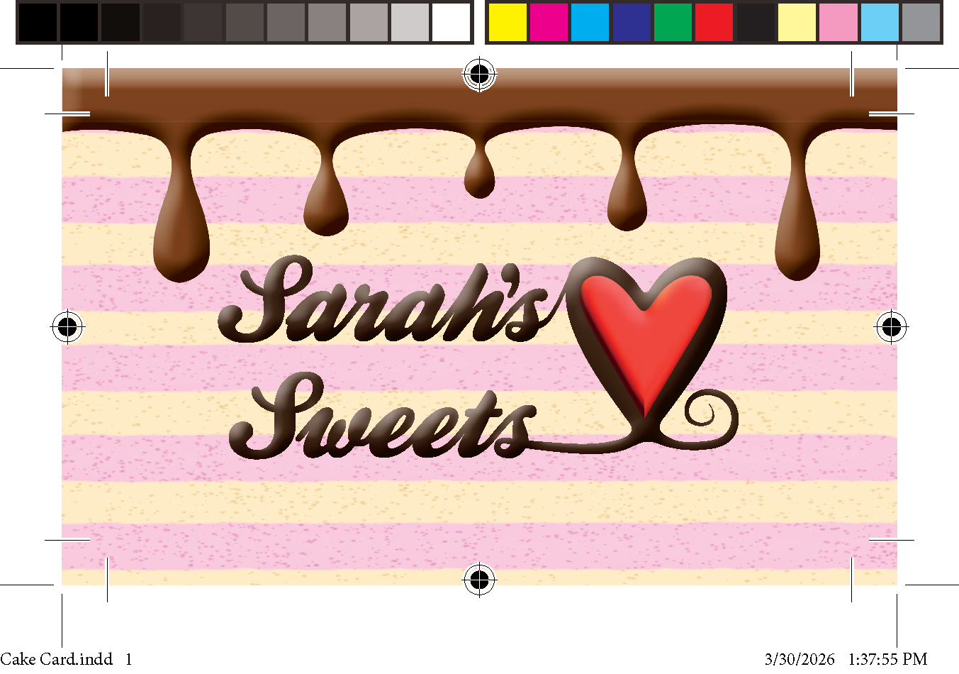
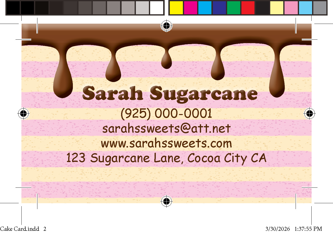
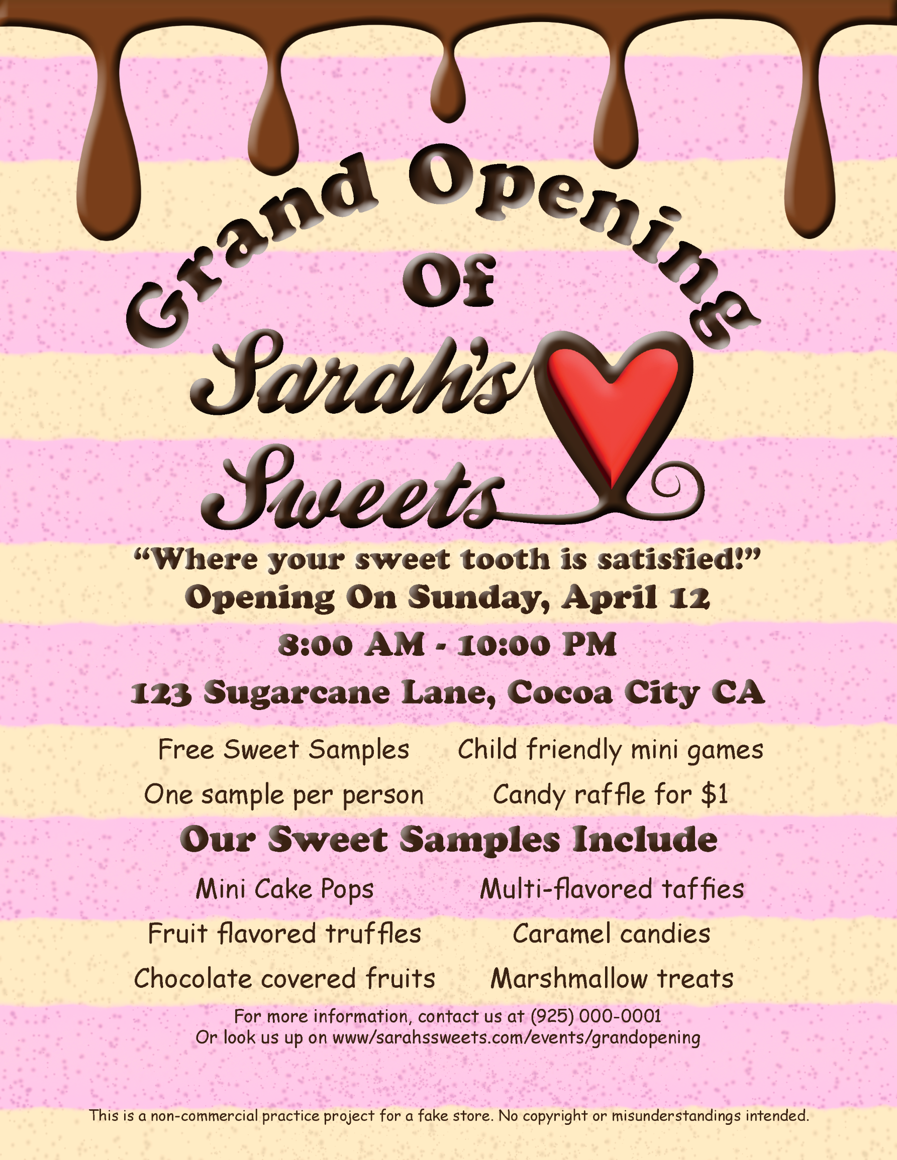
This is a grand opening poster and matching busines scards I made for an imaginary sweets store called "Sarah's Sweets." As the name says, it is a sweets and cake shop run owned and operated by a woman named Sarah Sugarcane. The busines crads are for the owner of the shop itself while the flyers are meant to spread the word about the shop's grand opening, while also visually arousing the appetite with the appearance of a cake with a chocolate drip.
I wanted to make a poster that would be both informative and visually appealing, while also arrousing the appetites of those who look at the flyers. So, I made the background to have pink and yellow-ish stripes that visualize a vanilla and strawberry cake, and used a dapple spray brush to make it look like there are air bubbles in the cake for a realistic touch. I also used an emboss effect for the bigger text to help it look like the words were amde with actual chocolate, as if ti were made by a chocolatier artist. The chocolate drip was also embossed for a realistic effect. The fonts I used for the flyer and business card alike are Cooper STD (Black) and Comic Sans MS (Regular). I made the chocolate drip and cake background using Clip Studio Paint. Everything was assembled and embossed in Adobe InDesign.
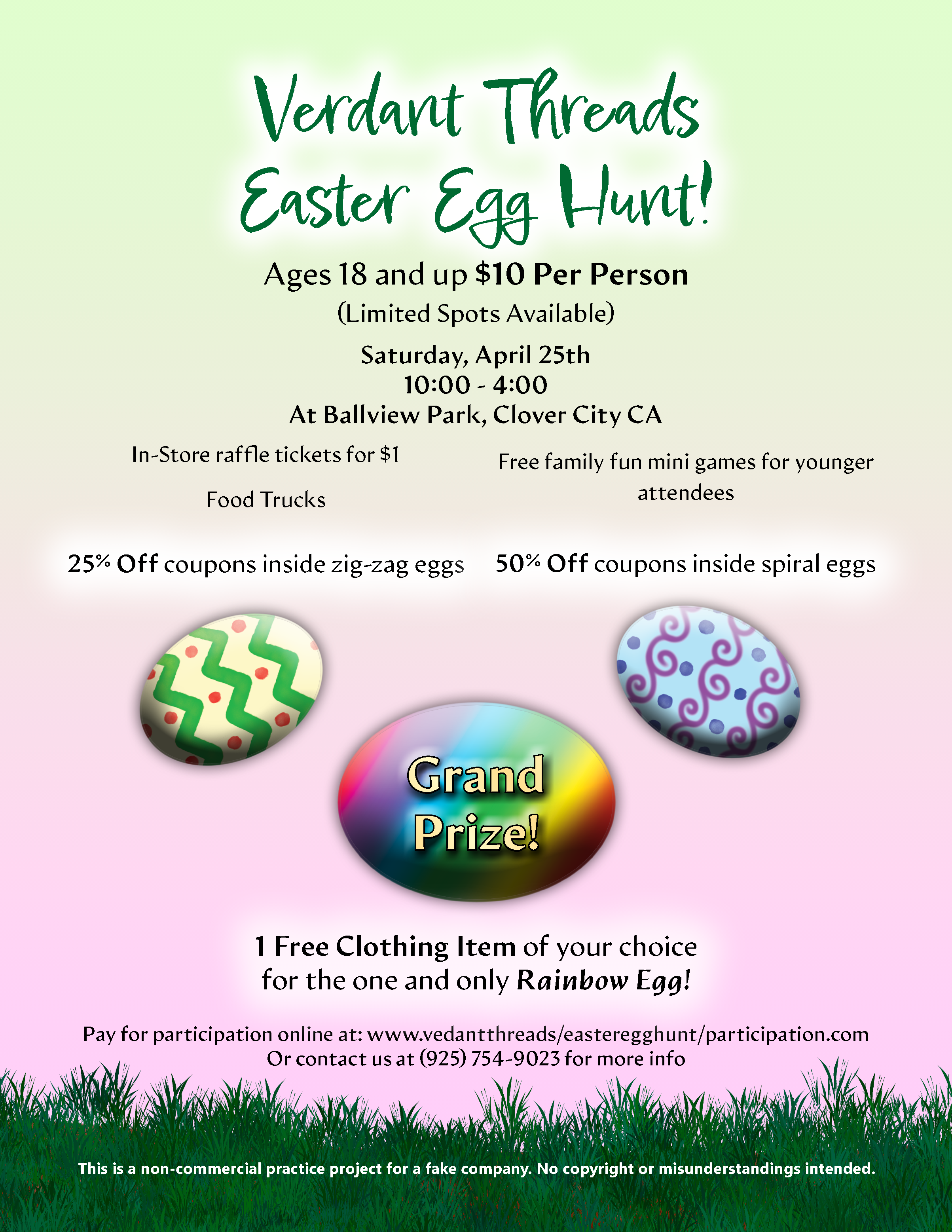
This is an event poster made for an imaginary company called Verdant Threads, which is a clothing store whose sole focus is on creating clothes from reusable and recyclable materials (imagine dup by ChatGPT). The flyer is meant to showcase and advertise an Easter Egg Hunt being hosted by them, and it showcases what the ammenities and prizes of the event are, with the grand prize being a free article of clothign for those who find the one and only rainbow egg.
I used the iconic green and pink easter colors for a gradient background, which dissapears behind a green grass bottom. I mae the eggs using the eclipse tool, a waterbrush, airbrush, and a gradient tool. I also gave the words "Grand Prize" an outter bevel effect. I also gave the header a white outter glow to ensure it stood out. The fonts I used for the flyer are Epicursive Script (Regular) and Artifex Hand CF (Book, Bold, Extra Bold, Heavy, and Heavy Italic). I also used Artifex Hand CF for the practice project note at the bottom. I emboldened and sometimes italicized the text telling the vital information for the easter egg hunt. I made the eggs, background, and grass using Clip Studio Paint nd combined all the assets in Adobe InDesign.
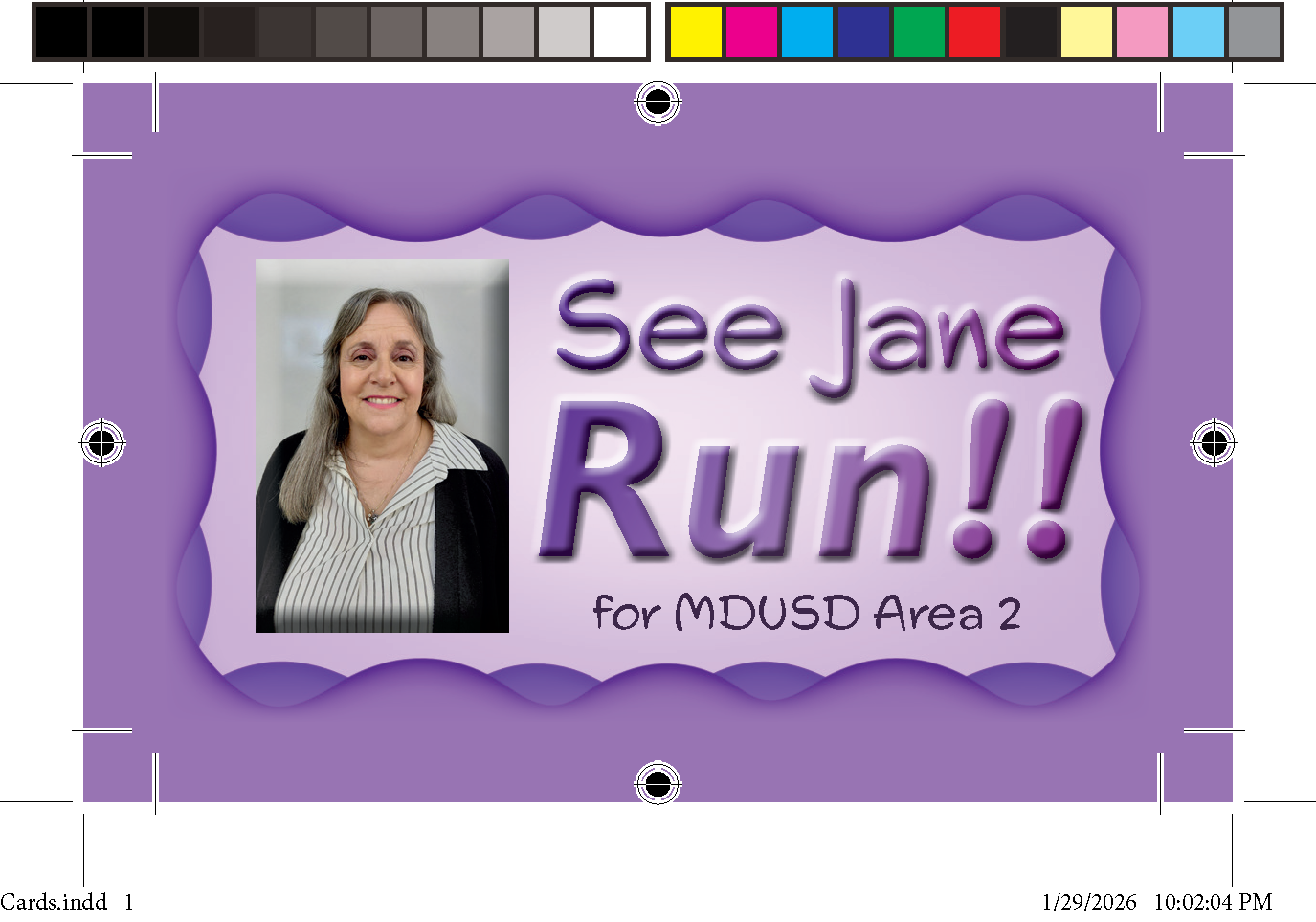
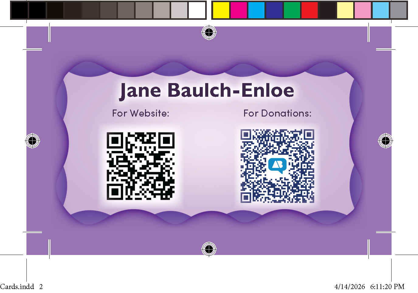
This card was made at the request of a teacher in the service of the Mount Diablo Unified School District, who is looking to introduce herself in the world of school politics. She wanted me to make a business card that she could hand out to people, as a means of getting into contact with her for them to support her advancement with the MDUSD.
All of the images and information was given to me by Jane Enloe herself. The color scheme was also at the request of my client, who made it clear that she wanted a purple color scheme to represent herself. I made sure the card had a somewhat childish, yet organized, professional, and bold, just like I see her to be. In light of this, I used embossing effects on the front fonts and the picture of her to help make them stand out. The fonts I used are Swing King, Gill Sans Nova (Semi Bold, Bold & Bold Italic), and Sofia Pro (Regular), which were provided by Adobe Fonts. The assets for the slate were assembled in Adobe InDesign and exported with bleed and cut marks to be sent to the printer.
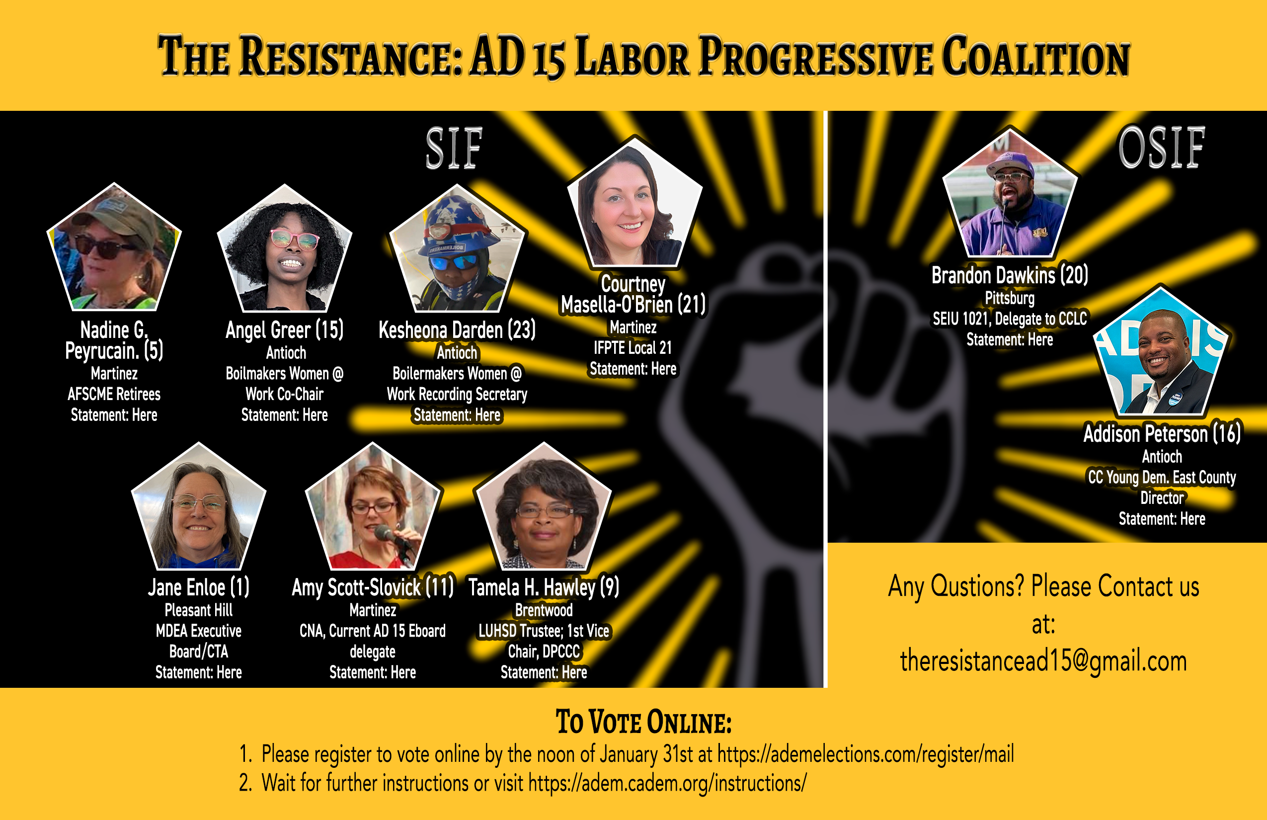
This slate was made at the request of a teacher in the service of the Mount Diablo Unified School District, and includes herself and every other member of her coalition. The slate was later made to be posted online as a link, and the words "Here" were each given a link to the information slates of each member found on the slate. The slate was divided into those who where Self Identified Females and those who weren't. The slate also provided instructions on how to vote for thee particular members and the email needed if the voters had any questions.
All of the images and information of the people were provide by the members found on the slate. The color scheme was also at the request of my clients. I made sure the flyer had a professional but also strong and empowering feel to it, so I used embossing effects on the fonts to make them stand out. The fonts I used are DIN 2014 (Demi), Avenir LT Pro (Roman), and Alegreya SC (Regular & Bold), which were provided by Adobe Fonts. The assets for the slate were assembled in Adobe Photoshop and links were added in later using Adobe PDF.
.png)
This flyer was made at the request of one of my very first paying clients, Amanda Szakats, a politician from Pleasant Hill, who wished for me to make a flyer to tell everyone about a community gathering that came with coffee at a local restaurant.
I wanted the flyer to have a similar style to Amanda's personal logo, so I designed the border to resemble the hills of her logo via Adobe Illustrator, and used the color green for all the words. I also made sure the flyer had a welcoming and casual feel to it, but also had a symmetrical layout to keep it professional. The fonts I used are Source Sans 3 (Bold) and Lato (Black), which were provided by Adobe Fonts. The assets for the flyer were assembled in Adobe InDesign.

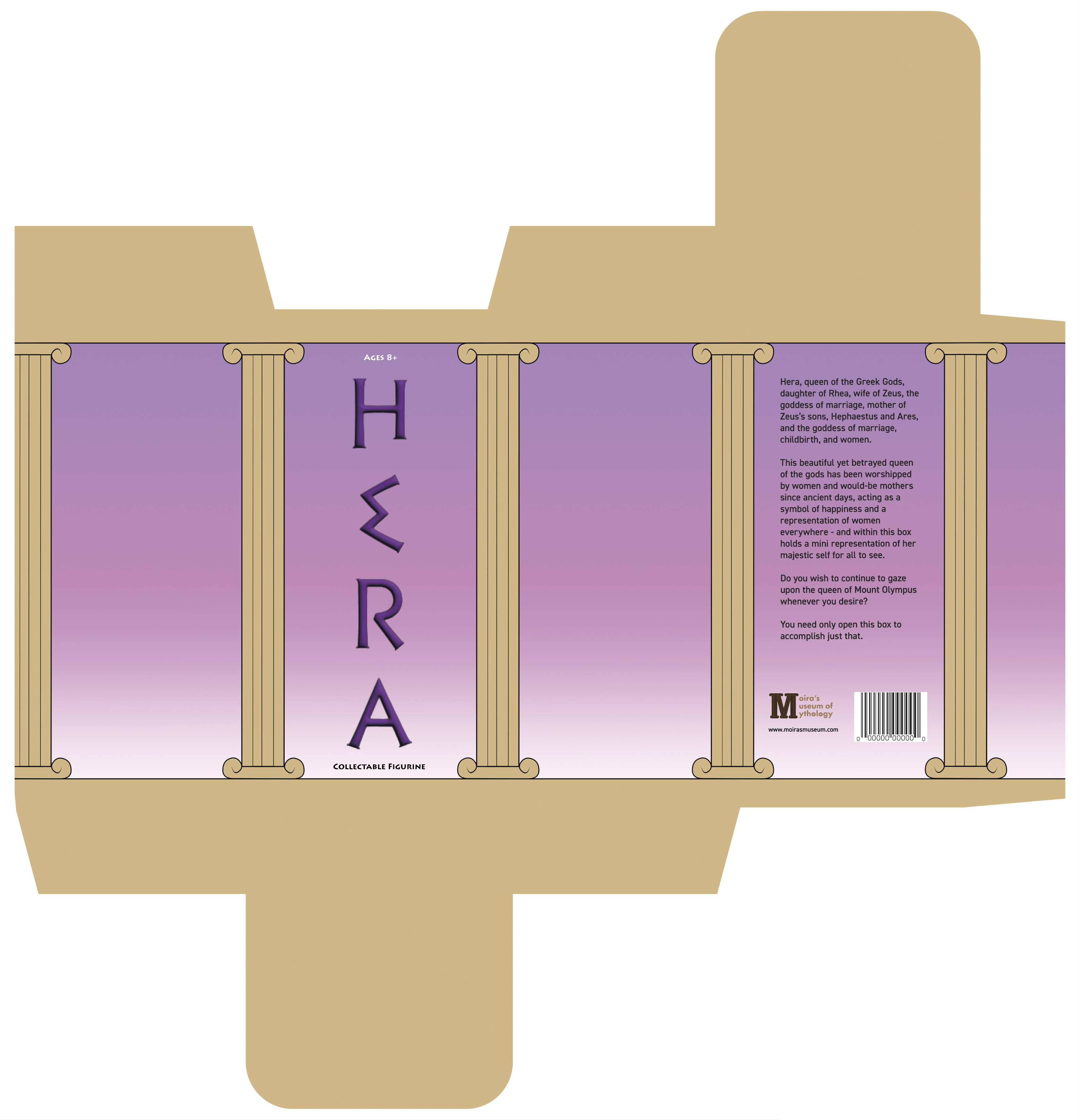

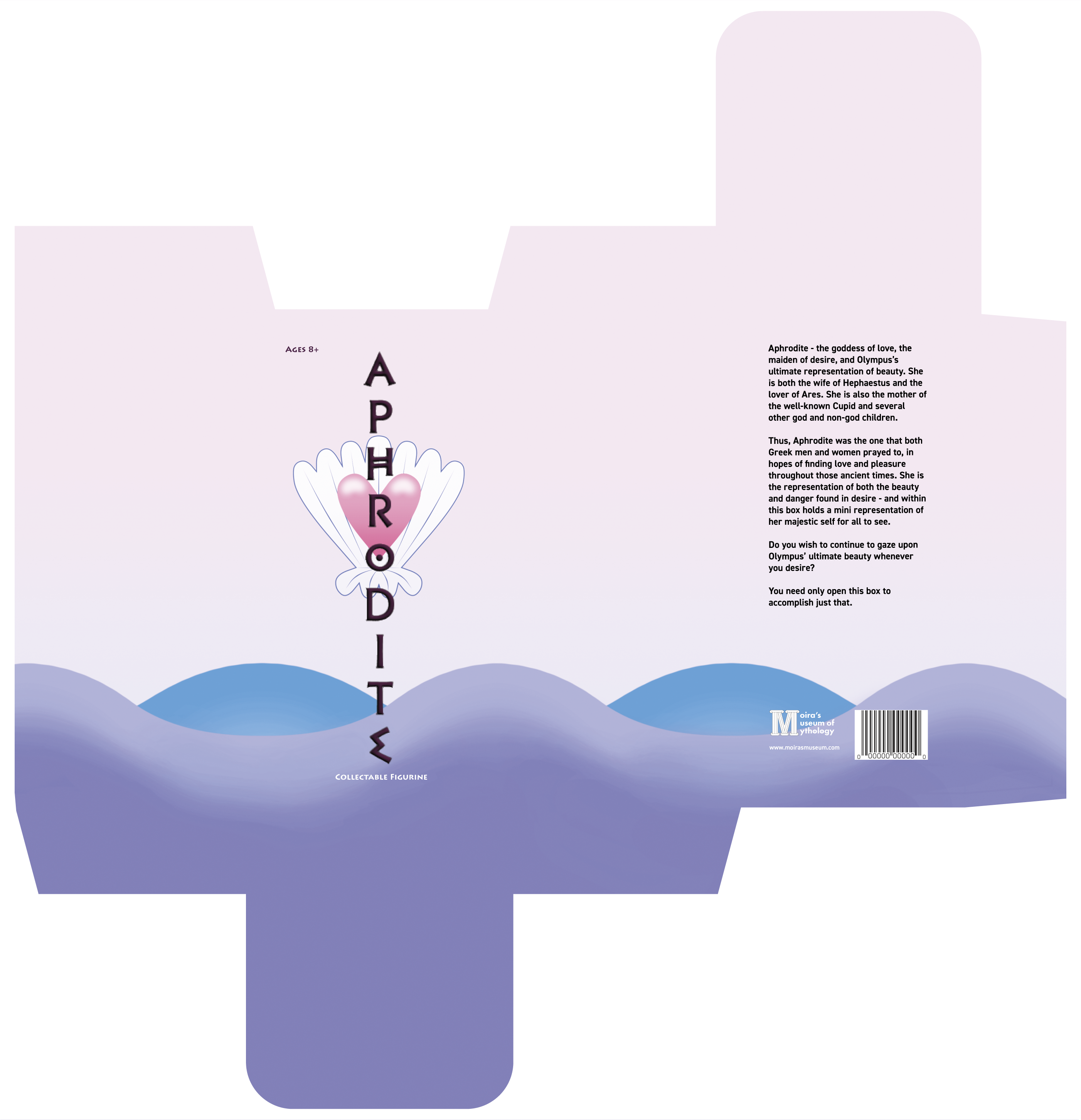
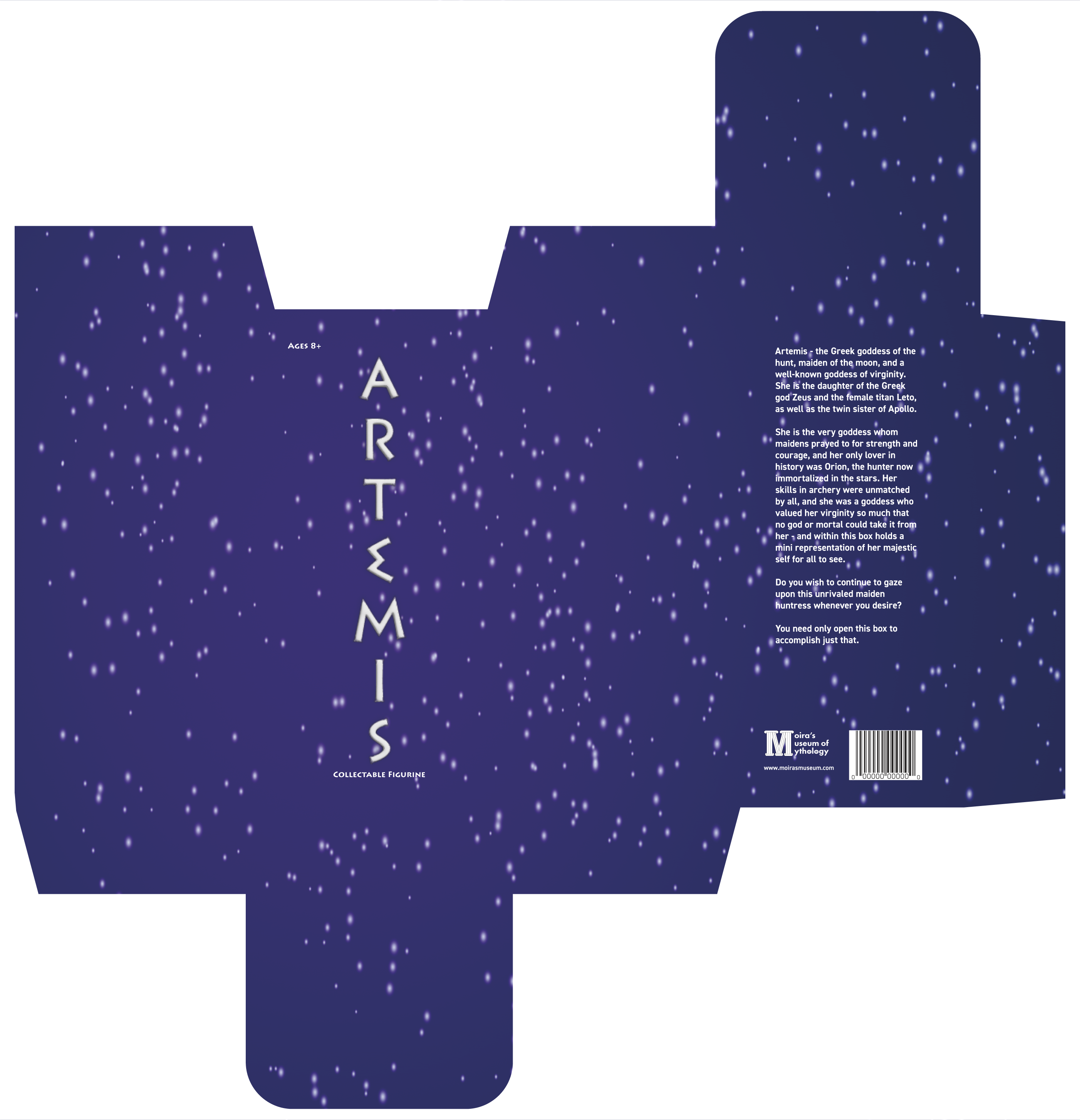
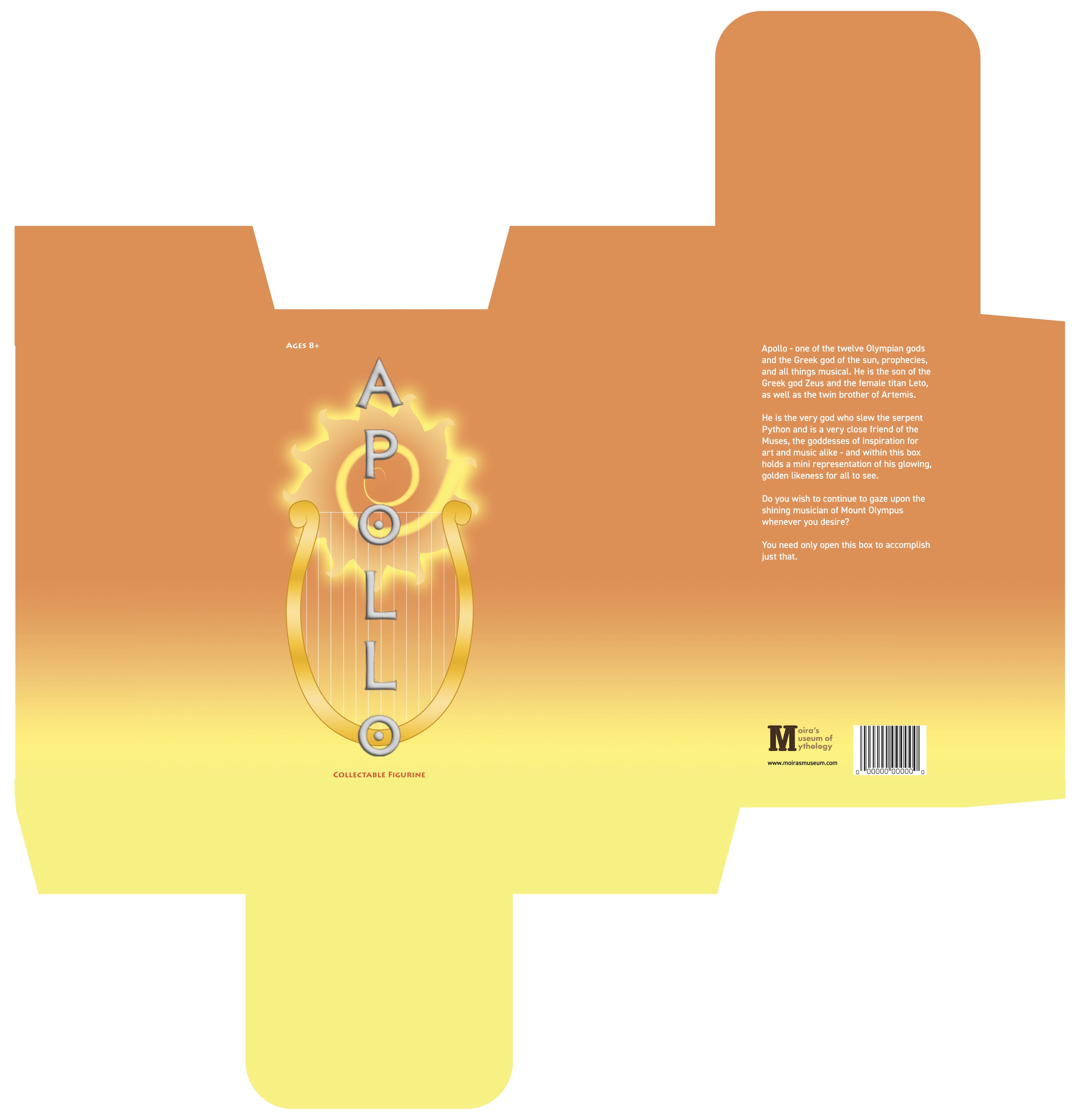
These figurine boxes were made as a part of my project for Moira's Museum of Mythology. These boxes were made to hold and represent the Olympian gods that were held within them, so each one has a different symbolism and color scheme, showcasing the variety of the Greek gods' powers.
I wanted each box to properly depict and symbolize the gods living within them, so I gave each box a color scheme and imagery set that showcases the different powers they held during their reign. For example, Hera was the queen of the gods, so she gets a regal temple, and Apollo is the god of the sun and music, so his box has a harp and a sun, along with an orange and yellow color scheme. The fonts I used are PF Hellencia (Bold), Lithos Pro (Bold), and DIN 2014 (Demi), which were provided by Adobe Fonts. The assets for the boxes were assembled in Adobe Illustrator.

These posters were made as a part of my project for Moira's Museum of Mythology. The two posters depict two different aspects found in Greek mythology: the temples where the gods were worshipped, and the clouds in which the gods were said to reside.
I wanted the symbolism and connections of these posters to be obvious to anyone who would look at them. The first poster depicts a hallway of a Greek temple, complete with a rectangular roof and stone columns to showcase where the gods were worshipped by the people. The second one has a cloud border and a single column showcasing the shield of a hero, thus presenting the aspects of the home of heroes and gods, Mount Olympus. Each poster's illustrations were made by me in Clip Studio Paint, and I made sure each design was symmetrical and yet mythical in style. The fonts I used are PF Hellencia (Bold) and DIN 2014 (Demi & Regular), which were provided by Adobe Fonts. The assets for the flyer were assembled in Adobe Illustrator.
Graphic Design
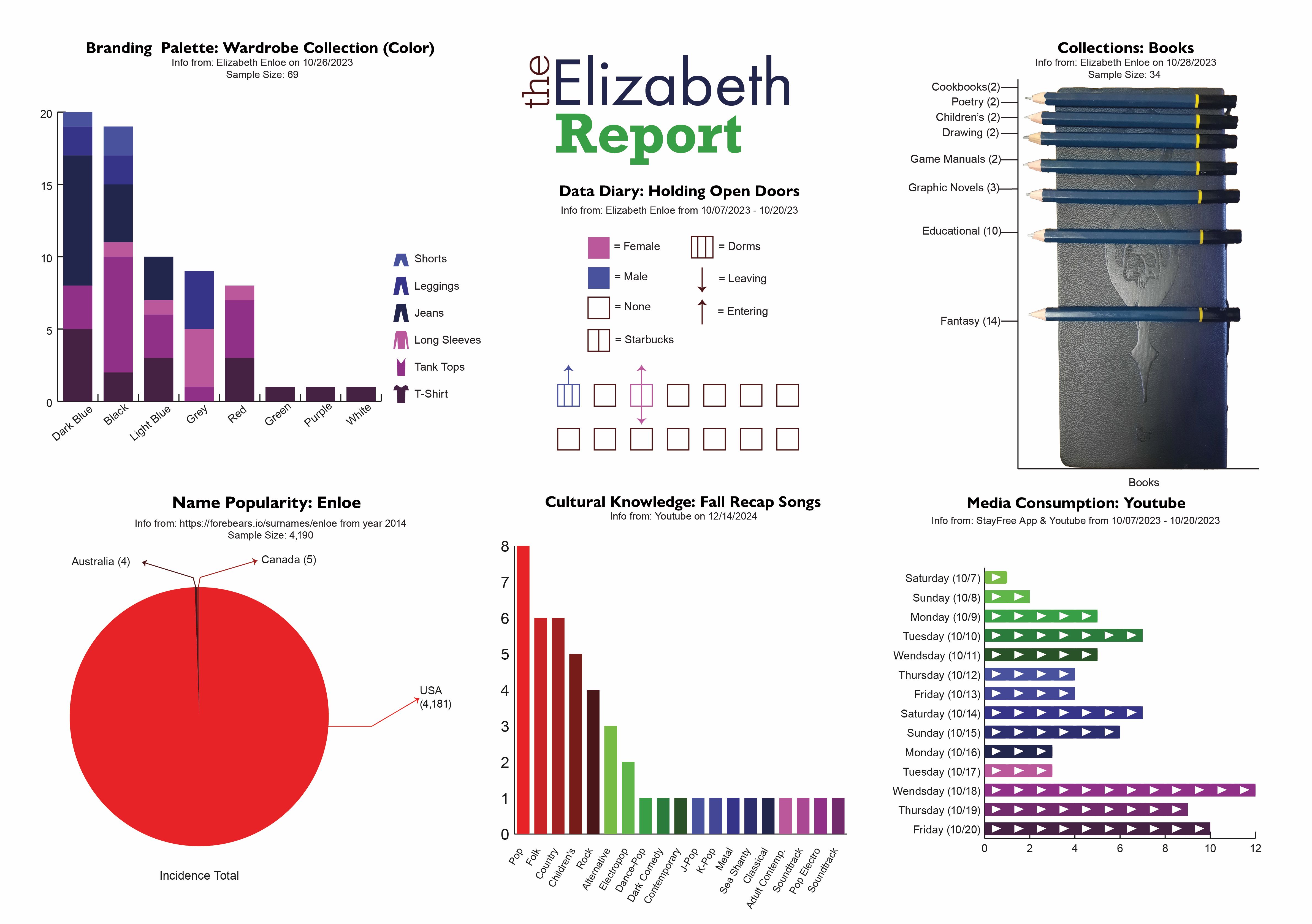
I have created a visually appealing poster using Adobe Illustrator that showcases various data charts of my daily routines and habits. The charts depict information related to my TV viewing habits, collection of books, and the frequency of my courteous behavior of holding doors open for others. Despite the pressure of it being one of my school projects, it was still an enjoyable and self-educational experience that I wouldn't have missed for the world.
It took me two weeks to compile all the data, and I had to keep track of everything constantly. I made the charts using Adobe Illustrator and the data compiled during my self-monitoring time. The fonts I used to make this poster are Futura PT (Book), Rockwell STD (Light & Bold), and Arial (Regular), which were provided by Adobe Fonts.
If you like what you see and want to work together, get in touch!
elizabethenloe500@gmail.com